I know the word "reboot" is so overused these days, but I thought it was time to revisit this dead blog and reboot it into something different.
Henceforth, "Comics Sunday" will now be a blog that highlights various artists found on the site Deviant Art and their awesome comic/manga work. It will be updated, as far as my plans go, every Wednesday and Sunday.
So, without any more preamble, here we go with the June 17th edition of Comics Sunday!
###
If there's one artist that you need to know about right now, it's Daniele Torres. The native Brazilian has been a hidden gem on DA for the past 5 years. She primarily does pin-ups of Marvel Comics' female stars, such as the classic Jubilee shown to your left. If you visit her gallery, you'll also find pics of Emma Frost, Domino, X-23, Supergirl, Power Girl, and probably her favorite character, Lara Croft, whom Daniele has nailed to a "T."
Daniele recently joined an art studio in Brazil, which means her commission prices have probably sky-rocketed, but the last time I checked she was charging $40 for a penciled pin-up such as this one. Daniele has a bright future ahead of her, so stay tuned...I have a feeling she's headed for bigger things!
###
As if one great artist wasn't enough, we have another one here who excels at penciling, inking, and visual design. His name is Yildiray Cinar, and has been on Deviant Art for only a few years. He got himself noticed by DC Comics, who signed him to a contract (an all-too familiar occurrence these days) and put him to work on their New 52 Earth-2 book, with Power Girl and Huntress in the leading roles. To the right is one of Yildiray's earlier pieces, highlighting his excellent inking work as Batman heads to Gotham's slums for clues.
I especially like this piece due to the contrast between the light & dark areas and how the window draws your attention right to Batman. Keep an eye on Yildiray's work, because he only keeps getting better.
###
You're probably sick of the Batman pics already, but this is one I just had to point out. It's by Peter Habjan, an American artist who works as a graphic designer & storyboard artist for film, TV, and animation. Peter's work is always breathtaking, since he starts with pencils and then digitally paints and colors the rest of the piece. This one, where Joker gets the drop on Batman, is probably one of my favorites, due to the lighting technique, the colors, and that priceless look on Batman's face.
Peter doesn't update his Deviant Art page very often, but when he does, it's always worth a look. Be sure to add him to your DA watch list!
###
Okay, enough about Batman--time for some green-skinned superheroine love. This pic of She-Hulk is by none other than Brazil's own Marcelo DiChiara, who actually did some fill-ins for Marvel & DC in the mid-2000's and illustrated the Power Pack & Iron Man mini-series that came out around the same time. Since then he's been posting like mad on Deviant Art, taking on Daily Sketch Challenges and going so far as to ink & color them for that professional touch.
Marcelo has a commissions post on his DA profile, but it's from 2012, so I would send him a note or e-mail before requesting his services. And hey, he's got a major thing for She-Hulk, so if you do too, so much the better!
###
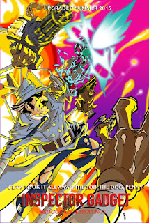
Now for something completely different, as we highlight the work of comic artist Michael Watson. This particular piece caught my eye because 1) I love Inspector Gadget fan art, and 2) I love the cel-shaded coloring job on this. Michael conceived this piece as a summer blockbuster remix of Inspector Gadget, and while I think the idea was sound and the art is solid, I really don't care for all the guns popping out of him because, well, Gadget never needed guns--he had gadgets, Brain, Penny, and Penny's computer book, remember?
Michael is currently publishing his own indie comics through his publishing brand Titanium Comics, and frequently collaborates with other indie creators on DA. Check out Michael's gallery & his comics--his star is definitely on the rise.
###
And that's all for now, folks! Tune in next Sunday, same Bat-Time, same Bat-Channel (I know, enough with the Batman stuff, right?) for more spotlights on some great artists you've probably never heard of. Until then...
###
DISCLAIMER:
All art featured in this post is copyright its original owners and no copyright infringement is implied or intended. The writer did not receive any compensation for the posting of the various artists' work.
Wednesday, June 17, 2015
Monday, August 19, 2013
Comics Sunday #7 -- Sidekick #1
During the silver age of comic books, it seemed as though every hero
had a wet-nosed teenage sidekick.
Captain America had Bucky. Batman
had Robin. Superman had a whole family
(Superboy, Supergirl, and even Krypto the Superdog). The Flash eventually gained a sidekick with
the uninspired name Kid Flash. The list
goes on and on. And mostly, when you
hear fans talk about sidekicks, it's that they hate them. They're annoying saps who couldn't protect
themselves from an intergalactic snail invasion (as cool as that might be), and
whenever they die, the fans cheer and jeer appropriately.
When I heard that J. Michael Straczynski was releasing a series called
"Sidekick" through Image Comics, I was skeptical. What kind of story could he tell about a
sidekick that hadn't already been told?
Does the sidekick grow a spine, get a life, and strike out on his own? Is this a story about the sidekicks the fans
love to hate? Or is it something entirely
new and different, a take on sidekicks and their heroic, father-like
counterparts that we hadn't seen before?
Well, I've just finished reading "Sidekick" #1 for the third
time, and I can only say one thing: it's totally out of this world.
The story begins with your typical superhero comic situation--The Red
Cowl (the lead hero of Sol City) is busy fighting Sonic Master, and while he's
busy beating him into a pulp, Sonic Master's sound bomb is ticking away, ready
to destroy the city. Flyboy, Red Cowl's
sidekick and the focus of our story, grabs the bomb and flies high into Earth's
atmosphere, throwing the bomb into space, where it explodes safely. Flyboy has saved the day, and while Red Cowl
makes sure he gets all the credit in a press conference, we fast-forward to the
present day, where Barry Chase (Flyboy's alter-ego) is laying around in his
underwear in his apartment, smoking a cigarette and looking like ten miles of
bad road.
As the issue progresses, it switches back and forth between present-day
Barry's life and his past with Red Cowl, who is assassinated (in a John F.
Kennedy, motorcade-style fashion) during a celebratory parade for his saving
the city. When Flyboy checks the
rooftops, he finds a rifle, but no killer.
He also discovers that Red Cowl left him and his assistant, Melody, with
nothing, as he spent his vast fortune on gadgets, surveillance equipment,
vehicles, and secret laboratories that were in frequent need of rebuilding from
super villain attacks. In the present
day, Barry's struggling to make ends meet (his "Dreamstarter"
campaign to sponsor his heroic activities has only met $1,000 of its $100,000
goal) and struggling with the fact that no one takes him seriously as a real
hero since The Red Cowl's demise.
Add to this that Melody has hooked up with another man (hinting that
there might have been something between Barry and her in the past) and a rumor
that the Moonglow twins (some very beautiful and nasty-looking vixens) might be
responsible for Red Cowl's death, and you have yourself a great first issue
that shows a ton of promise and proves it can deliver on all fronts.
This was the first J. Michael Straczysnki comic book I'd ever read, and
I have to say that I'm very impressed. I
know the guy can write (I was an avid fan of his TV series "Babylon
5" for all five seasons), but because I'm not a huge fan of superheroes, I
never read any of his work on "Amazing Spider-Man" or
"Thor." With "Sidekick,"
Straczynski presents us with a dystopian superhero story that promises to consistently
kick Barry when he's down and put him through the wringer. He's already proven he can do that with this
first issue, and Barry is an easily identifiable character for many whose lives
have hit rock bottom. With the
combination of the realistic dialogue, the book-like feel of the characters,
and the seamless transitions from present to past and back again, Straczynski
proves there's nobody like him in the business today.
Tom Mandrake's art is perfectly suited to "Sidekick." His facial expressions, his natural-looking
musculature, and his realistic settings all fit the late-80's / early 90's
comic book era. Best known for his run
on DC's "The Spectre," Mandrake brings all of that knowledge and talent
to the table in "Sidekick," which is a very good thing. Hi-Fi's colors are some of the best in the
business, and he proves that here by making the days look brighter, the nights
look darker, and the heroes and villains look bigger and bolder. I've been a big fan of Hi-Fi's over the
years, and he totally nailed it with this one.
What else is there left to say about "Sidekick?" How about "go out and buy it!" Seriously, you won't find a better written,
drawn, and colored superhero book out there, and if you like your superhero
stories a little darker and a little edgier, than you won't be
disappointed. You can find
"Sidekick" at your local comic book shop or online at many fine
retailers, and if you would like a little more information on the comic, head
over to www.imagecomics.com and look it up.
Monday, December 24, 2012
Comics Sunday #6 -- Freelancers #1
Some of you may recall that I recommended this comic in my "Independent Scene" column a while back. Now that I've read the first issue, I am sad to say that Freelancers didn't measure up to my expectations at all.
The story has remained intact from the original solicitation by Boom! Studios, but now they've added Felipe Smith to the mix, a manga artist who recently spent a year in Japan working for Tokuma Shoten. If this was supposed to impress me, it didn't, because a year in Japan working for a major manga publisher didn't exactly help Felipe's writing skills.
Freelancers is so full of cliches from the neo-noir genre that I could barely swallow the story. You've got the hot blonde (Cassie) who can drive like nobody's business; you've got your crazy-ass Asian chick (Val) whose only use is to provide blatant fanservice and kung-fu fight scenes; and you have a colorful, pop-induced representation of Los Angeles, which fails on so many levels it's hard to keep count.
The plot (courtesy of Darkwing Duck writer Ian Brill) is paper-thin and seems more like an excuse to get Cassie and Val in as many kung-fu fights as possible. The art by Joshua Covey keeps shifting from good to bad to worse throughout the comic, with some panels appearing as though they were ripped straight from the 1960's Batman TV series. This gave me the impression that Freelancers was trying to imitate Blue Estate's art mash-up style, but while Blue Estate succeeded in that endeavor, Freelancers drops the ball like the kid who always gets picked last to be on the kickball team.
The cliffhanger of the issue is also a cliche warmed over again and again by TV crime shows: Cassie ventures inside an abandoned building, the guy she's searching for is strapped to a chair with a bomb attached to him, and the timer on the bomb hits zero. Outside, Val sees the building explode and cries Cassie's name. As if we didn't know this already, a "To Be Continued" is slapped in the bottom right-hand corner to remind us that this awful comic actually has a second issue coming out.
To make the issue a full thirty-two pages, Felipe Smith drew a back-up story involving Cassie and Val's days at a kung-fu orphanage. This is drawn in a manga style that is so horribly warped it made Cassie and Val look like they had cerebral palsy. Points off for not only using the manga style in an American comic book, but for not even doing it right.
The final insult of Freelancers is Val's dialogue. I have never seen a character so annoying in all of modern comic-dom. Her conversations with Cassie go in circles and mostly involve talk about paying the rent, beating people up, finding something to eat, and trying to land a boyfriend. Val is nothing but every anime girl cliche rolled into one, and reading her dialogue just made me cringe.
If you're looking for low-brow entertainment that insults the reader's intelligence and pretends that you haven't seen all of this before, then by all means, pick up Freelancers. But if you're looking for something truly entertaining that has an actual plot, likeable characters, and some eye-popping art, then you'd best look elsewhere.
Sunday, October 28, 2012
Comics Sunday #5: Buck Rogers Future Shock TPB
"Nothing else
makes sense. We've been worrying over
the wrong question. It's not the
where...it's the when."
--Anthony "Buck" Rogers
Truth or Dare
When I started collecting comics back in 1993 during the big comic
book boom, there were two major houses--Marvel and DC. That was pretty much it. You either liked
Spider-Man or Batman. Iron Man
or...Booster Gold, I guess. The Avengers
or the Justice League of America. On my
side of town, anyone who liked DC was a loser.
They just didn't know how to make exciting comics, or so my friends
thought, as I quietly hid my Green Lantern collection from their prying eyes.
Unfortunately, that whole one-or-the-other attitude carried
over into my second run at comic book collecting, which started with Brad
Meltzer's Identity Crisis. No matter what those eleven year-old kids may
think now, I became a permanent DC fan because of that book (I think a lot of people did).
When I paid a visit to my local comic book
store (aka "The Happiest Place on Earth") a few months ago, I spotted something completely different on their "just
in" shelf. It was the first Buck
Rogers trade paperback volume, titled Future
Shock, produced and released by Dynamite Entertainment.
My first reaction upon viewing Buck in his glowing, Tron-like suit was "I have got to see what this is
about." I paged through it at a
casual pace, noting Buck's humorous narration boxes and the attractive take on
Wilma Deering. Within a minute I had
reached the last page and decided that this was coming home with me.
This was the first time I had ever read or purchased a
Dynamite Entertainment title, and these guys should be winning every Eisner
award under the sun. While everyone's
out there arguing over Spider-Man's rogue's gallery (and frankly, who has time
to care about them anymore) and which Batvillain is going to take over Gotham
next (again, why should we care), Dynamite has been stealing all the glory from
right under Marvel's and DC's noses.
Don't believe me, eh?
Fine--I'll prove it to you.
The Gravity of the Situation
Volume One of Buck Rogers collects the first five issues of
the series, which introduces a new set of circumstances that, eventually, place
Buck where he needs to be--five hundred years in the future and with Colonel
Wilma Deering rescuing him from certain doom.
This Buck Rogers, along with his friend Craig McDonnell, has
developed a gravity drive that allows him to travel through space at Ludicrous
Speed. Basically, it takes all the
gravity from the surrounding fields and planets and pushes it in the direction
you're traveling, therein pushing you forward at speeds unknown.
Unfortunately, the military has seized Buck and Craig's
invention for a mission to intercept an impromptu Noah's Ark, en route to deep
space from Mars. While this wouldn't
normally be cause for alarm, a psychotic plague infected the researchers on the
red planet, making them kill each other and basically go ape-shit. One of these researchers took a strain of the
plague and, along with DNA from 50 other animals, launched it in this
"ark" before he died.
Buck's mission is to intercept this Ark of Doom and blast
the thing out of the sky before it causes any more trouble. And speaking of trouble, Buck engages the
gravity drive and totally overshoots the Ark of Doom until he disappears from
radar completely...and reappears five hundred years in the future, crash-lands
on Earth in his "antique flyer," and gets rescued by Colonel Wilma
Deering in a sexy trans-suit (which actually makes the noise
"biddi-biddi-biddi" when it's low on power--gotta give 'em credit for
that).
Over the next four issues, Buck and Wilma try to escape the
clutches of The Pack, a race of genetically engineered mammals who can speak,
walk on their hind legs, and interact with humans on all levels. They're also hunting humans for food like
wild game, which is not a pleasant thought, but it does hark back to the
science fiction writers of the golden age (if you consider The Pack and their
mission as a form of social commentary like I did).
Wilma proves that she is not some shrinking violet who needs
rescuing every issue--not only does she have looks, but she has brains and
combat skills to back them up. It's an
empowering female character in a genre mostly reserved for scantily clad,
sword-carrying bimbos and anime girls with clothes that shred like tissue
paper. I would like to congratulate the
Buck Rogers creative team for making Colonel Deering capable, confident, and
downright cool.
Once Buck and Wilma get a distress signal to their comrades
on Earth, Buck's gravity drive (left behind in his "antique flyer")
is commandeered and installed in the Starbuster, one of the Earth fleet's
rocket ships, so they can go rescue our hero and heroine. With the technology of the 25th century, the
drive finally works the way it was supposed to, catapulting the Starbuster from
Earth to Mars in a few panels.
Personally, I think all they needed was a really good electrician.
Volume One wraps up with the Earth Flight Troopers storming
The Pack's vessel. Deering and her team
go to rescue any human captives, while Buck goes to gum up the engine
room. I don't intend to give it all
away, but he calls his plan "Operation: Hot Lunch." As Deering puts it to one of her Flight
Troopers, "I don't get it either," but you will by the end of this
book, along with a great many other things about Buck's past on Earth, his
present, and where things are headed in the future.
The Men Behind The Curtain
I had never read Scott Beatty's work before, but I was
familiar with the name. I am now proud
to call him one of my favorite writers because of his work on Buck Rogers. The way he cuts from past to present and back
again, the way Buck's narration is often interrupted (or completed) by
present-day dialogue, and the clever humor injected at the right moments are
what made me keep reading this book till it was over...and left me craving for
more. That's the sign of a great book,
and since the next trade paperback is still available, I don’t have long to
wait.
The art team of Carlos Rafael (pencils and inks) and Carlos
Lopez (colors) knock this thing right out of the park. To paraphrase Buck, "This is like the
stuff I read in comic books and novels."
While giving everything a 21st-century edge, Carlos and Carlos also
manage to keep the 20's and 30's feel of Buck intact as well, and it's really
something to marvel at. The glow on the
Flight Troopers' suits is very reminiscent of Tron, and at the same time, is something altogether new. The atomizers are very retro and also very,
very cool (I'd like a six-pack of them to go, please). The covers by John Cassaday, especially the
covers for issues one and two, really stand head and shoulders above the rest
due to his art and Lopez's coloring.
Dare I say "Dynamite does it right"?
Simon Bowland's letters are not a problem and they don't
clutter up the panels. Those are my two
complaints about letterers, and as long as they pass those two criteria,
they're in good shape. The other thing I
noticed about Simon's letters was the font he chose for the Pack's leader
characters, who walk around in rotund, bulky mech-suits. Because it was thin and lightly colored it
was a little difficult to read, but this is really just nitpicking.
And finally, when you put everything together, you have a
slam-bang sci-fi action comic book that has totally rebooted Buck Rogers for a
new generation of fans while keeping the old fans happy (I know it kept me happy, at any rate). The one thing I did notice about these first
five issues is the breathless pace they run on--every issue ends on a
cliffhanger, daring you to turn the page and keep reading. You just can't put this thing down until you
run out of pages, so be warned--once you start reading Buck Rogers: Future Shock, you won't want to stop...and that, my
friends, is actually a good thing.
Wednesday, September 12, 2012
Quick Takes -- 9/12/12
The Independent Scene
I'll just tell you this up front--I'm not that into superheroes.
Frankly, I'm tired of them. There's too much baggage associated with their characters. Years of continuity and back-story clog up what should be an enjoyable reading experience. And to be honest, there are only so many powers, so many costumes, and so many names you can use before you've seen them all.
That's why I'm heavy on the "indie" side of comics. Publishers like Boom! Studios, Big Dog Ink, Antarctic Press, Archie Comics, and many others fill my pull box. It's rare that you'll find a Marvel or DC book in that box, and even rarer that you'll find an Image or Dark Horse book.
I'm always encouraging readers devoted to the Avengers and the Justice League to come over to the independents and see what they're like. A break from superheroes is what the comic industry needs, and there are lots of great writers out there besides Hickman, Bendis, Millar, Johns, Ennis, Ellis, and their copy cats.
So here are some of my recommendations if you're interested in exploring the indie side of comics.
Freelancers
Freelancers is published by Boom! Studios, one of the larger forces in indie publishing, and features the adventures of Val and Cassie, two kung-fu bounty hunters who grew up in an orphanage. As they traverse L.A.'s glitz, glamor, and grime, their mentor becomes one of Los Angeles County's most wanted criminals, and it'll be up to Val and Cassie to bring him in...if you can pry them away from the nearest food truck.
Freelancers #1 hits the shelves in October for the introductory price of $1.00 and features the work of Ian Brill (from Boom's Darkwing Duck series) and the art of Joshua Covey. I'll tell you that I'm really excited about this series, because I'm getting a big Blue Estate-like vibe from its themes and cover art. Boom! has done some great work lately with creator-owned series (such as Fanboys vs. Zombies and The Hypernaturals) and I believe Freelancers is going to be their next big hit.
Keep your eyes peeled for issue one's Phil Noto cover and keep your eyes on the Diamond Previews catalog, so you can get your hands on the first and future issues of Freelancers.
Fanboys vs. Zombies
Fanboys vs. Zombies is published by Boom! Studios and is up to Issue #6 as of this post. Launching in April, the series chronicles a group of fanboys and fangirls attending the 2012 San Diego Comic Con in the midst of a zombie infestation. Having watched every zombie movie, played every zombie video game, and read every zombie comic book, they feel they're our best (and only) hope to defeat the zombies and bring order (and Twitter) back to the world.
Fanboys vs. Zombies started off with a $1.00 introductory issue that featured eight different covers that included the likes of Khary Randolph, Ale Garza, Humberto Ramos, and Eddie Nunez. The series is written by Sam Humphries (who also writes Boom's Higher Earth) and features the art of Jerry Gaylord and the awesome coloring work of Nolan Woodard. The series is chock-full of nods to movies, anime, comics, convention stereotypes, and geek culture, with character dialogue written in text-speak and anti-zombie weapons borrowed from every video game under the sun.
I've been a huge fan of this series from issue #1 and I've been hooked ever since. There's at least one character that everyone can relate to or identify as an anime/comic stereotype, and the tongue-in-cheek humor is always spot-on and never offensive or inappropriate. That says a lot in a comic book industry that seems determined to push the boundary of the indecent on a daily basis.
This series comes highly recommended if you like your zombie comics a little on the humorous side and empty of pointless zombie rules only die-hard fans seem to be aware of. Keep you eyes on the Previews catalog or ask your local comic book store to add Fanboys vs. Zombies to your pull box. You won't be disappointed.
Mega Man
If you grew up in the 1980's and had an 8-bit NES system, chances are you know who Mega Man is. The video game's premise was simple--Mega Man, a two-tone blue robot, had to defeat Dr. Wily and his army of robot masters. The trick was that after you defeated a robot master (such as Cut Man, Bomb Man, or Guts Man), you gained their special ability, which you then used to defeat another robot master.
Archie Comics' Mega Man comic book, which started back in 2011, has reached Issue #17 as of this post and is a big hit with fans young and old. Writer Ian Flynn and artists Patrick Spaziante (issues #1-4), Chad Taylor (issues #5-8), Ben Bates (issues #9-12), and Jonathan Hill (issues #13-16) have brought an anime/manga-style look to the comic that makes it accessible to everyone and doesn't alienate those who prefer their comics drawn in the Western style. While the comic does tackle the Nintendo games (they've covered games 1 and 2 so far), there are story arcs between the games that flesh out the characters and allow for Flynn and his rotating stock of artists to flex their creative muscles and develop a whole new universe for Mega Man to inhabit.
This has quickly become my favorite comic book every month, thanks to Ian Flynn's fresh writing and Patrick Spaziante's breathtaking covers. The series just wrapped up their latest story arc, Spiritus Ex Machina, and will be tackling the origin of Proto Man with Issue #17, which just came out this week. If you aren't reading this title, you're missing out on a comic that's a lot of fun and a break from the melodramatic and overly-serious comics that are on the shelf today. Ask your local comic book store to add Mega Man to your pull box and start getting in on the action today, and keep your eyes open for New Crusaders: Rise of the Heroes, Ian Flynn's new superhero series that features the art of Ben Bates.
The Legend of Oz: The Wicked West
If you've seen the classic film The Wizard of Oz or read any of Marvel's Oz material, you probably think you know the Land of Oz. So did I...until I read Big Dog Ink's The Legend of Oz: The Wicked West, written by Tom Hutchinson and illustrated by Alisson Borges. This comic turned L. Frank Baum's classic story into a neo-western tale and re-imagined a whole universe of characters (including a Tin Man who's a bullet-proof, tough-as-nails sheriff and a Toto who's a black stallion). Instead of ruby slippers, Dorothy is armed with revolvers that fire ruby bullets, and she's a tough-as-nails gunslinger who's been searching for the yellow brick road for three long years.
Wicked West just wrapped up its six-issue run, but Big Dog Ink has announced an ongoing series launching in October. The series has featured covers by Borges and fan-favorite artist Nei Ruffino, and the ongoing series will launch with a cover by Eric Basaldua of Zenescope fame. Tom Hutchinson (who also writes Critter and Ursa Minor for Big Dog Ink) used his imagination when he created Wicked West and reinvented a set of characters in a smart fashion, instead of making Dorothy some older, over-sexed femme fatale or turning the Tin Man into a Terminator-like cyborg.
This series took me by surprise and I've been hooked ever since. Hutchinson proves that a comic is nothing without its script, and he delivered the goods on every issue of Wicked West. Alisson Borges's art is lean when it needs to be and didn't clutter up the panels with too much detail or inking. Kate Finnegan's colors enhanced Borges's art and brought everything to vivid life whether you were in Oz or Dorothy's native Kansas. If you enjoy comics that remix classic novels, are a big fan of The Wizard of Oz, or both, The Legend of Oz: The Wicked West should be in your pull box come October.
###
Feel free to leave comments and/or feedback on your favorite indie titles and which comics you think should make the next Quick Takes list.
Until next time, this is Justin A. Swartz, signing off!
(And don't forget to check out my other blog, Movie Monday, where I review movies that I find for ten bucks or less!)
--Justin A. Swartz
Sunday, May 6, 2012
Comics Sunday #4: Book Smart
"I just want to go home. I am very tired of all this craziness."
--Jadit, Book Smart
###
Jimmy Palmiotti and Justin Gray are my favorite writing team in the comics world. They've written a ton of Jonah Hex and are currently working on All-Star Western for DC, but what they do best, in my opinion, is create independent comics that have the style of a Hollywood action movie. One of these (and their latest effort) is Book Smart, published by Jason Netter's Kickstart Comics, which features the gorgeous artwork of Juan Santacruz and Juan Manuel Tumburus.
The story (and with these guys, it's all about the story) starts in the Himalayas, where a woman discovers what appears to be a shrine of some kind. Her guides knock her out and steal her survival gear, leaving her stranded in the cold. Someone discovers her and takes her to a doctor in Nepal, who tells this poor lady that she's suffering from temporary amnesia--she can't remember her name, her address, or even what she looks like.
The doctor sends the woman to an English teacher named Sean McDermott, who agrees to help her find out who she was and where she came from. Meanwhile, a Nepali terrorist named Choata is searching for the same woman, since she discovered the shrine, which is not a shrine at all, but a depot for surplus communist weapons.
As this comic unfolds we discover a few things about the woman, who adopts the name Samantha Rayne--she can take care of herself in a fight and sends more than a few of Choata's men back to their master in shame; she's witty, smart, and cool under pressure; and her and Sean have this really cute "do they love each other or don't they" thing going on.
Add to this the accurate depiction of Nepali society and its corrupt government workings and you have a graphic novel that's simply a lot of fun to read. Palmiotti and Gray keep things fresh by creating an intriguing setting for Samantha's adventure and keeping everything within the realm of plausibility. Their dialogue has always been their strong point, and it shines on every page of Book Smart.
Santacruz's lines are clean and highly detailed, giving Nepal, the Himalayas, and the other locations in the story a vividness that you don't find in other books. Juan Manuel Tumburus's colors are bright and fit the art like a glove. Of special note are the bluish tones used inside the shrine of weapons and the icy Himalayan regions.
If you're looking for an action film but don't know which one to watch, don't watch any of them--pick up Book Smart, which has all the trimmings of an international spy thriller packed into one handy 88-page graphic novel. For only nine bucks you can't go wrong, you're spared the cost of popcorn and overpriced soda, and with the talents of Jimmy Palmiotti and Justin Gray, you know it's going to be one heck of a ride.
If you like Book Smart, you might also like Trailblazer and The Tattered Man, available from Image Comics for $5.99 and $4.99, respectively. Both are written by Palmiotti & Gray and feature similar Hollywood movie-style plots. I highly recommend checking them out if you're a fan of independent comics and/or just want something different from the superhero norm.
--Justin A. Swartz
Wednesday, March 14, 2012
Comics Sunday No. 3 -- Flashpoint TPB
Reviewed by Justin Swartz
"Oh, Barry. Look what you did."
--Eobard Thawne (The Reverse Flash), Flashpoint
Lame Brain
For years I've felt that Barry Allen, AKA The Flash, is the lamest character in the DC universe. So he's the fastest man alive. Big whoop, I thought. Anybody on meth can do what The Flash does. As for villains, he's got Gorilla Grogg, Mirror Master, and...yeah, that's pretty much all that comes to mind. He's part of the Justice League, but I always felt like he was their pinch hitter. And until yesterday, I still held that same opinion about The Flash.
Yesterday I got a hold of DC Comics' Flashpoint trade paperback, which collects issues #1-5 of last year's pivotal miniseries. Writer Geoff Johns had just been appointed Chief Creative Officer, and he took the stage with one of the best artists in the business, Andy Kubert. The "strange attractor" for this miniseries was that, as the title implies, it dealt primarily with The Flash and cast him as the lead hero.
I'm usually not one for the big yearly events because I think it's all a greedy, corporate-driven effort to make readers buy more comics. I'm also not one for superheroes, because I've simply outgrown all the superhero b.s. that goes on (first they're dead, then they're not dead, then they're in a separate dimension, then someone else takes their place, then they fight that guy to take back their place, etc.). When I saw that Andy Kubert was drawing Flashpoint, I decided I'd give it a chance, if only to see his take on the DC superheroes...and boy, was I ever surprised.
Brave New World
Flashpoint begins with Barry Allen sleeping on the job. He's been pulling all-nighters trying to crack a cold case in his day job as a forensic investigator. When he hears that the Pied Piper and Citizen Cold are duking it out, he rushes out of the office and down the hall, reaching for the ring that holds his costume. Unfortunately, there is no ring, which means no costume, and that means Barry falls down the stairs...and lands at his mother's feet.
Barry can't believe his eyes. Somehow, some way, his mother is alive and well...but that also means the course of time has been altered. Barry's mom should be six feet under, murdered by his father, who died in prison. According to Mama Allen, Barry's dad died of a heart attack three years ago. And the worst part? She's never heard of a Justice League, any hero named Flash, or anyone named Superman.
As the action shifts to show the various heroes of this radical new timeline (including a Batman who's not afraid to cross the line, a Cyborg who is America's favorite son, and a whole family of kids that combine to form Captain Marvel), Barry comes to the conclusion that he's not trapped in an alternate timeline--this is the real world. He's just the only one who remembers what the old word was like, and page by page, his old memories are being replaced by ones from this brave new world. If he doesn't fix everything soon, he won't remember what needed fixing, and the DC Universe will stay like this forever.
Give The Man A Hug
I'll say this up front: I like Geoff Johns. I think he's a very imaginative writer with a lot of experience to back him up. With that said, I was wary of picking up Flashpoint because I hated Blackest Night (which was just an excuse to cash in on the zombie craze) and didn't care for Brightest Day (the one where Johns had to clean up the mess he made in Blackest Night). I wondered how far Johns would go this time with his love for graphic violence and his panache for sensationalism, two things which made me stop reading comics almost ten years ago.
I was pleasantly surprised to see a very clean, very substantial, and very imaginative tale wrought on the pages of Flashpoint. Geoff Johns knew that The Flash isn't a graphically violent kind-of guy, so he shoved that aside (thank God) and worked on what mattered--the characters and their relationship to our hero. The Batman of this universe learns what it means to be a good guy by hanging out with The Flash. The Shazam Kids agree to stand up for what they believe in and fight alongside Flash, Batman, Cyborg, and the others. But the most compelling thing about Flashpoint is its portrayal of Aquaman and Wonder Woman as bitter enemies, since in this timeline, the big WW has slain Aquaman's long-time love, Mera, and now wears her battle helmet as a symbol of the victory. Aquaman isn't the nicest guy on the block either--he's killing anyone who comes near his territory and dressing in the colors of Aqualad, who would have been his son.
What's probably the coolest thing about Flashpoint is the big reveal of the Flash's archnemesis, Eobard Thawne (AKA The Reverse Flash), as the man who killed Barry's mom and pinned the murder on his father. It makes you hate him, and you hate him even more when you realize that because of the timeline shift, he doesn't exist in any timeline, making him free to do whatever he wants to whomever he wants--including any of Barry's loved ones in the past, present, or future. And what makes Flashpoint such a well-written book is that everybody gets what they deserve--especially Thawne--and it makes you want to cry, cheer, and laugh with them. I can't commend Geoff Johns enough for writing such a powerful and evocative superhero story that will stay with me for a long time.
As for the art, Andy Kubert's pencils are dead on target. From the first issue cover (with the Flash's costume ripping to shreds as he runs) to the panel where Batman cries (I cried too), his lines were detailed, clean, and made your jaw drop. Sandra Hope's inks only intensified this effect, bringing all of Kubert's musculature to bold life. But the person that I feel really made this comic work was colorist Alex Sinclair, who hit a home run on just about every panel. The Flash never looked flashier, Batman never looked broodier, and the supporting cast never looked better. This book is full of color and all of it is bright and welcoming, unlike the dark, horror-movie tones adopted by most colorists today. If I could give Alex Sinclair a hug of appreciation, I would do so.
The Second Time Around
What did I take away from Flashpoint? That sometimes a superhero story doesn't have to be dark and brooding in order to get its point across. That sometimes The Flash can be a cool character. That sometimes...I need to just shut up, buy the comic, and not judge it by its cover or because it's one of the those danged yearly events. Marvel's Fear Itself may have bombed, but DC's Flashpoint was the one that had the skill, the precision, and the heart to get the job done. I loved every minute of it, so much so that I went back and re-read the series the second I was finished...and it was even better the second time around.
Subscribe to:
Posts (Atom)